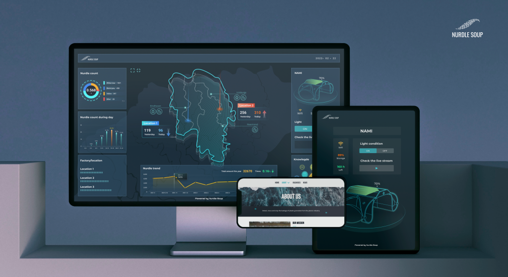
In addition to the hardware, we are developing user interfaces to visualise the data collected by Nami, and present the analysed information directly to the companies and publics. This includes map information, nurdle count, usage of Nami, etc.
COUNT
The number of nurdles collected from Nami is calculated and made into charts, which can intuitively show the trend in the number of nurdles in different periods, as well as different types of nurdles.
Map
Combining the resulting data with maps allows us to see the surrounding environment and nurdle leaks in different regions, and potentially trace their origins. By doing it, the relevance of nurdle to people's lives is shown clearly.
NAMI
The dashboard is used to display Nami's model diagram, power, network connection and storage, it can also control Nami's lighting system.
Knowledge
By clicking the bubbles of the KNOWLEDGE part, visitors will be redirected to an external website with the related knowledge of hurdle.
What's next?
We will be able to collect live data remotely and display it on the interface. In addition, we will customize the data visualization according to the situation and needs of different companies or stakeholders.
Get in touch and follow us on LinkedIn and Instagram!